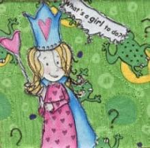
 Another cold weekend meant more sewing, and a few episodes of Northern Exposure (I adore John Corbett, and treated myself to the boxed set of DVDs) into the evening I managed to finish the binding. I had originally thought I'd use red for the binding, but didn't have enough of the one I wanted, so I ended up with a black and white stripe instead, and I'm glad I did. It picks up the black lines in the white fabric in the middle and makes it a better match for the smaller quilt I've got on the wall already. I quilted it with (sort of) straight lines randomly criss-crossing from edge to edge trying to avoid corners between the blocks, where you get a lot of seams meeting.

And here they are together. They are very bright, aren't they? But then I tend to go for bright, clear colours, because they are the ones that make my heart sing. The trend in my guild is very subdued, taupe and soft pastels at the moment, so mine don't really fall in line. But then neither do I ;-) Or maybe I'm right on the cusp of a new trend: I just noticed that the
Pantone colour for 2010 is Turquoise. Anyone visiting my blog will have noticed that this is a colour close to my heart. So maybe 2010 is my year?
According to the Pantone site, Turquoise is believed to be a protective talisman in many cultures, a color of deep compassion and healing, and a color of faith and truth, inspired by water and sky.
"With both warm and cool undertones, Turquoise pairs nicely with any other color in the spectrum. Turquoise adds a splash of excitement to neutrals and browns, complements reds and pinks, creates a classic maritime look with deep blues, livens up all other greens, and is especially trend-setting with yellow-greens."
You just can't go wrong with Turquoise it seems. ;-)

 I'm thinking of piecing the back from my stash of green fabrics. What do you think? There are several there which never seem to be just the right green for whatever I'm working on, so it might be a good way of pressing them into service. I think green would be OK as a complement to all those florals - you need some foilage to go with them, right? And since there are all sorts of greens in the florals, I have an idea that I might make this work.


