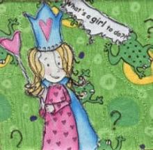
On the wall


 I will just have to keep the squares up on the wall and mull it over for a few days. That usually helps, even if my design wall is just a flannel sheet with grommets in two corners, hooked up on my bedroom wall...


 I will just have to keep the squares up on the wall and mull it over for a few days. That usually helps, even if my design wall is just a flannel sheet with grommets in two corners, hooked up on my bedroom wall...
Posted by
mathea
at
Tuesday, January 08, 2008
![]()

No comments :
Post a Comment